
King Crab
Premium king-crab dining
One crab, five courses — booking becomes the first taste
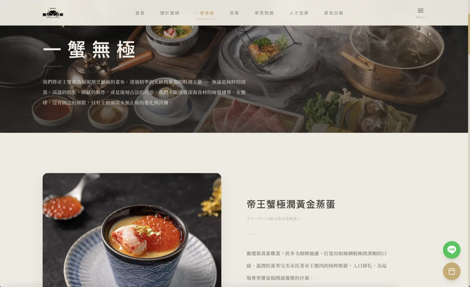
King Crab is a premium restaurant built around live king crab flown from Norway, two seatings of 12 each per night. Guests are discerning and ceremony-sensitive — they want the brand voice from the moment they book. Brief: (1) visually convey the live + tableside-cut value; (2) make the five-course flow obvious at a glance; (3) frictionless reservation.
Deep charcoal + crab-shell red + warm cream — a dim-bar atmosphere that highlights the ingredient. Hero is full-bleed photography with a heavy dark gradient; the menu lists Roman numerals I–V with generous spacing; the red capsule CTA repeats across every viewport for clear booking intent.
Scroll past the hero — ingredient, courses, booking in one flow
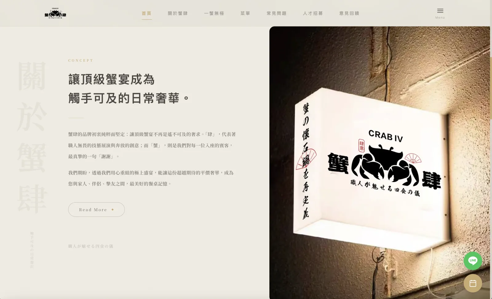
After leaving the hero, guests need to see "why King Crab" immediately. This page lays out the live transport, tableside service, and five-course flow — landing on the booking CTA.
What this build would use
- Next.js 15
- Sanity CMS
- Stripe
- Resend
- Google Calendar API